Introduction
We have maps of magnetic anomaly, elemental concentrations, bedrock structures, lithology, gravity anomaly, electric conductivity, and other features, that we know reflect the underlying geology. We have satellite and drone imagery that we want to relate to the properties of the ground surface and vegetation, or a hyperspectral drill core image that we wish to use to map the mineralogy of the core. Such data comprise of hundreds of thousands or even millions of data points with tens to hundreds of parameters defined at each data point. One of the approaches to start studying such a complex dataset is to use self-organizing maps (SOM) and clustering. In this blog, I will show an intuitive example on how SOM can be used to explore multivariate geospatial gridded data with the aim to distinguish lakes, peatland and forest areas.
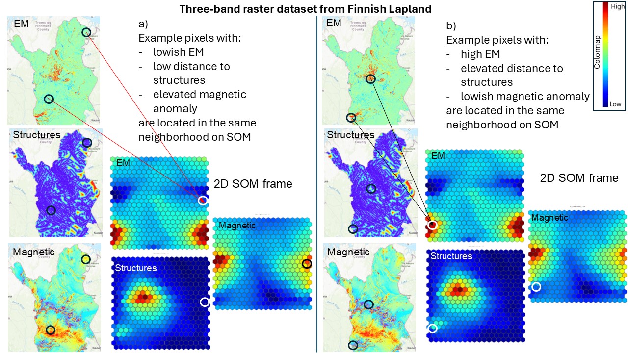
Figure 1. Allocation of data points on SOM. The geospace maps show electromagnetic (EM) response, distance to structures and magnetic anomaly of Lapland. All similar feature vectors are allocated to the same location on SOM (two similar pixels are shown as an example for both cases a and b). The square maps show the distribution of the features on SOM. The arrows visualize the allocation of the pixels from geospace to SOM space on the EM maps. On other feature maps, the corresponding locations are just circled.
SOM and k-means clustering
SOM is a visually appealing method for studying the structure of a multivariate dataset. The idea of SOM is that it organizes the input data points on a map (the SOM) so that similar data points lie close to one another. The SOM map is not related to geospatial coordinates in any way, and the input multivariate dataset may be either spatial or non-spatial. In geoscientific research, the datasets are often spatial and may be expressed, for instance, as a stack of rasters where each pixel represents a data point with several feature values stored in a feature vector. SOM arranges the data so that similar feature vectors (i.e., pixels or data points) are allocated to the same neighborhood on SOM and affect the feature values on SOM in this neighborhood (Figure 1).
SOM is often accompanied with k-means clustering (Figure 2). The aim of clustering might be to distinguish clean water from contaminated water, deep peatlands from shallow ones, different forest types, mineralogy of drill cores, or regions with high mineral potential from those with low potential. In general, classification of the data is needed to be able to make decisions on how to act in different places and circumstances. As geoscience data most often does not have a well-defined cluster structure, the choice of clustering algorithm makes a difference. Using SOM as the base for k-means clustering helps in finding the best clustering solution and in evaluation of the goodness of the clusters and relations between the clusters.

Figure 2. K-means clusters in geospace and SOM space computed for the SOM result shown in Figure 1. Boxplot diagram of the EM data is shown as an example of visualizing the distribution of features in clusters.
GisSOM
The results of SOM can be represented in so many ways that it is challenging to implement a good SOM tool inside other software, such as GIS software ArcGIS and QGIS. In the NEXT (Horizon 2020) and DroneSOM (EIT RM) projects, we have implemented the stand-alone GisSOM software for applying SOM and k-means clustering for especially spatial data. We have aimed at an interface that would be intuitive and provide the results in easily understandable form. Non-spatial data can also be used as input, but the emphasis has been on visualizing the results in geographic space and the relation between the geospace and SOM space. With GisSOM, we can visually study the distribution of the data in the multivariate feature space and the relations between the features.
Case study
In the following, I will demonstrate how SOM and k-means can be used to study a raster dataset from around the Kuopio city in Finland (Figure 4b) with the aim to divide the region into different types of subregions. The input data comprise of the G-band of an aerial RGB image, slope of the ground surface, as well as the gamma radiation map and the out-phase component of the induced electromagnetic (EM) field from airborne geophysical measurements (Figure 3).
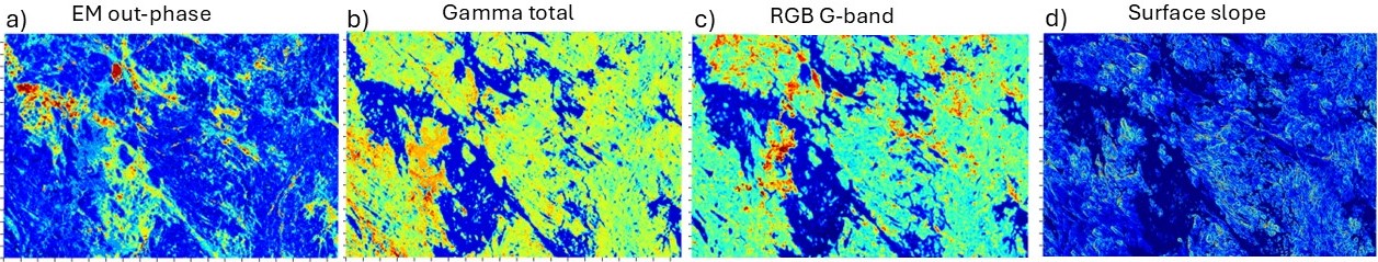
Figure 3. Input data: a) electromagnetic (EM) response of the ground (out-phase component), b) gamma radiation from the ground (total of uranium, thorium and potassium), c) green (G) band from RGB aerial image, and d) slope of the ground surface.
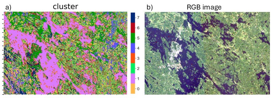
Figure 4. a) Cluster map from SOM and k-means and b) RGB map of the study area.
Interpreting SOM space results
After running the SOM and k-means algorithms in GisSOM, we get a geospace cluster map (Figure 4a), showing with different colors the different types of areas that can be distinguished from the input data. To investigate the characteristics of the subareas, we can study the result in 2D SOM space (Figure 5). In our dataset, we had labelled some data points (grid points) based on whether they represent lake (L), peatland (P) or forest (F). The locations of the labeled data points on SOM are shown on the cluster SOM (Figure 5a) using the corresponding label L, P or F. Cluster colors on the cluster SOM correspond to those on the geospace cluster map (Figure 4a).
We see that the lakes (label L) fall in cluster 1 and peatlands (label P) in cluster 4, while forest (label F) is distributed in several clusters, mainly 6 and 0, but also in 2 and 7. Comparing the U-matrix (Figure 5f) to the cluster SOM (Figure 5a), we can see which clusters are compact, i.e., with low internal heterogeneity. U-matrix shows the difference between the neighboring nodes on SOM and, thus, compact clusters have low U-matrix values in their area and cluster boundaries have high values. In this study, clusters 0 and 2 represent a relatively homogenous part of the feature space (blue color, i.e., low value on U-matrix), but are not clearly separable from each other (no clear boundary between them on the U-matrix). Other clusters have more internal variability (elevated values on the U-matrix). Overall, there are no clearly separable clusters in the data, as sharp cluster boundaries do not exist. These would be seen on the U-matrix as narrow yellowish or reddish stripes.
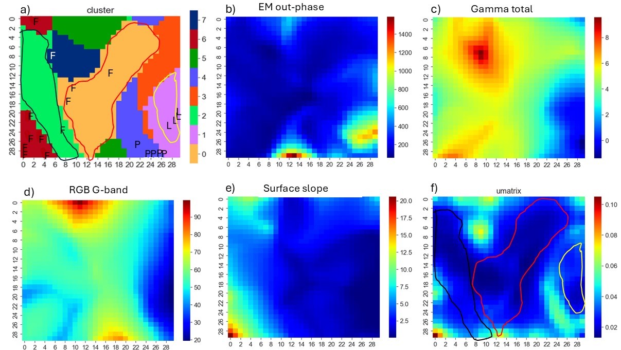
Figure 5. SOMs of the data. a) k-means clusters on SOM, b-e) input features (electromagnetic response of the ground (out-of-phase component), gamma radiation from the ground (total of uranium, thorium and potassium), green band from RGB aerial image, and slope of the ground topography), and f) SOM U-matrix.
The SOM maps can also be used to study how the input feature values are distributed in the clusters (Figure 6). The lake cluster (1) partly shows large EM out-phase response values, while for peatlands and forest these feature values are low throughout. Lakes also represent low gamma radiation and the lowest slope values, which is quite expectable. High slope values are present essentially only in one of the forest clusters (6). The G band of the RGB aerial image shows rather the brightness of the surface than its color. It is evident that lakes are dark, and the bright G band data points represent mostly urban areas (which had no labelled points). Large gamma radiation values in cluster 7 indicates thin and/or dry cover on the bedrock.
Distribution of the feature values in different clusters can also be investigated in GisSOM using boxplots. Figure 7 shows as an example that the gamma radiation values are nicely clustered so that the variation within a cluster shows a relatively constrained range of values. EM out-phase component contains many outliers within all but two clusters (6 and 7). This may mean that there are not enough clusters in the model to explain all the variability, or that data preprocessing should be done to handle the outliers.
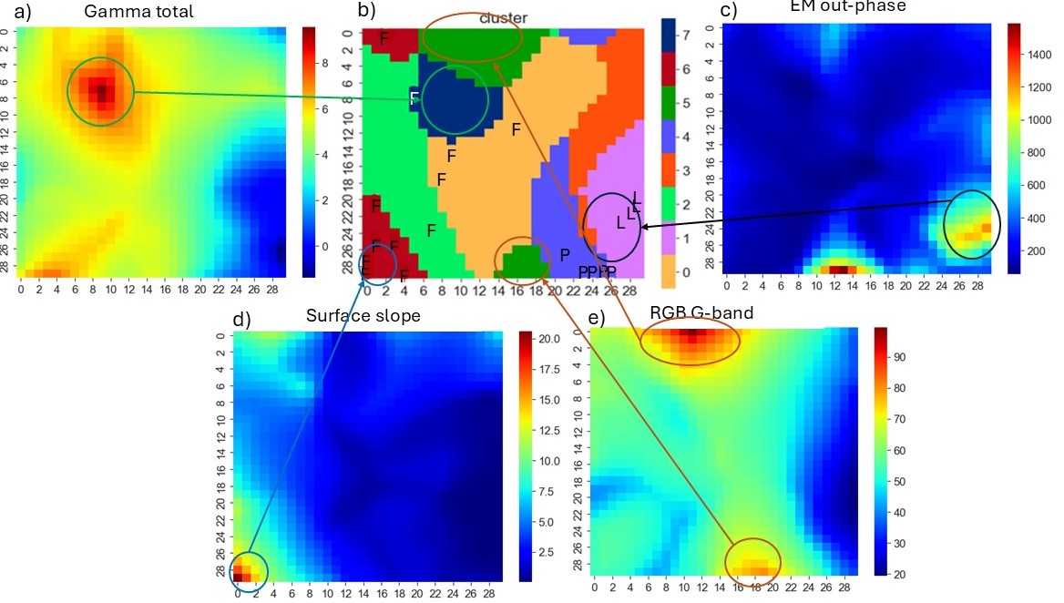
Figure 6. Distribution of high feature values in different clusters.
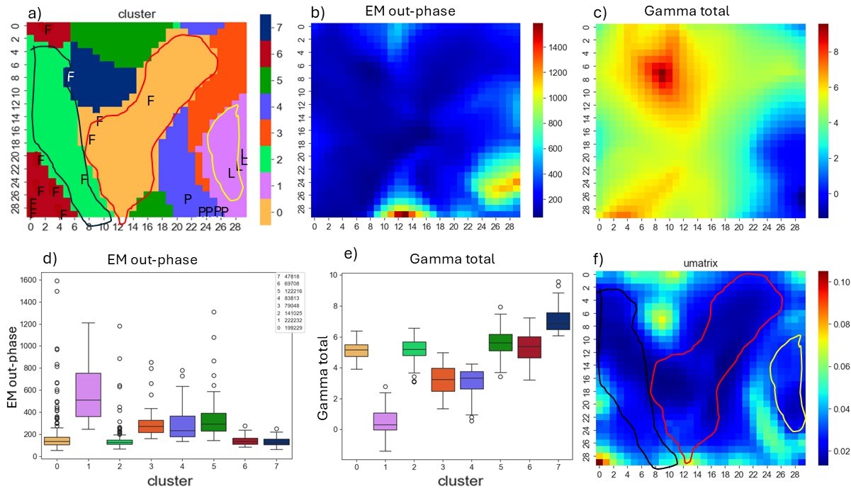
Figure 7. Distribution of gamma radiation and EM out-phase component values in the clusters.
Back to geographic space
GisSOM also plots the clusters in geospace (Figure 2a) with cluster colors corresponding to those on the cluster SOM (Figure 5a). Lake, forest and peatland classes can, thus, be directly distinguished in geospace as well. There are two clusters on SOM, where no labeled data points are allocated. Knowing the study region, we can say that they represent lake shores (cluster 3) and urban areas (cluster 5) for which we had not labeled any data points in our dataset.
Figure 8 shows clusters and the topographical map from a small subarea in the southwest part of the study area. We see that, even if not even close to perfect, this very quickly made example cluster model explains quite nicely different types of areas in the study region, differentiating lakes, peatlands, forest areas and outcrop areas.
Closing remarks
With this intuitive example, we wanted to demonstrate how to use GisSOM for clustering and classifying data. We are currently developing GisSOM in the DroneSOM Speed project which is a continuation to DroneSOM. Our applications in DroneSOM Speed will be concentrating on mineral potential modeling, and we hope to continue this blog story in the fall with results from our test sites.
If you are interested in applying SOM to your data, try GisSOM. In terms of research collaboration, the newest version 1.5 is available on request, while version 1.3 is freely available on GitHub (https://github.com/gtkfi/GisSOM).
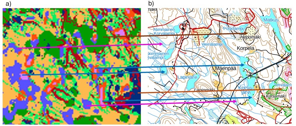
Figure 8. Clusters (left) and topographical map from a small subarea of the study area
Author
Johanna Pesonen
PhD Senior Scientist
Geological Survey of Finland